MySkin

MySkin is an AI backed mobile skincare tracking app that allows users to analyze their skin and track skincare routines. This project focused on creating a more engaging journal entry experience to reduce churn and increase use consistency.

Date

March 2026

Service

Experience Design

Client

MySkin

The Problem

Other apps in the skincare industry tend to be overly clinical and overly manual. As a result, users struggle to consistently log routines daily and there is an emotional disconnect between the user and the product.

In addition to this, MySkin's current interface fails to meet critical accessibility criteria and is visually overwhelming and unclear.

The Goals

  • Encourage

  • Support

  • Meet

daily use
self-reflection
accessibility standards

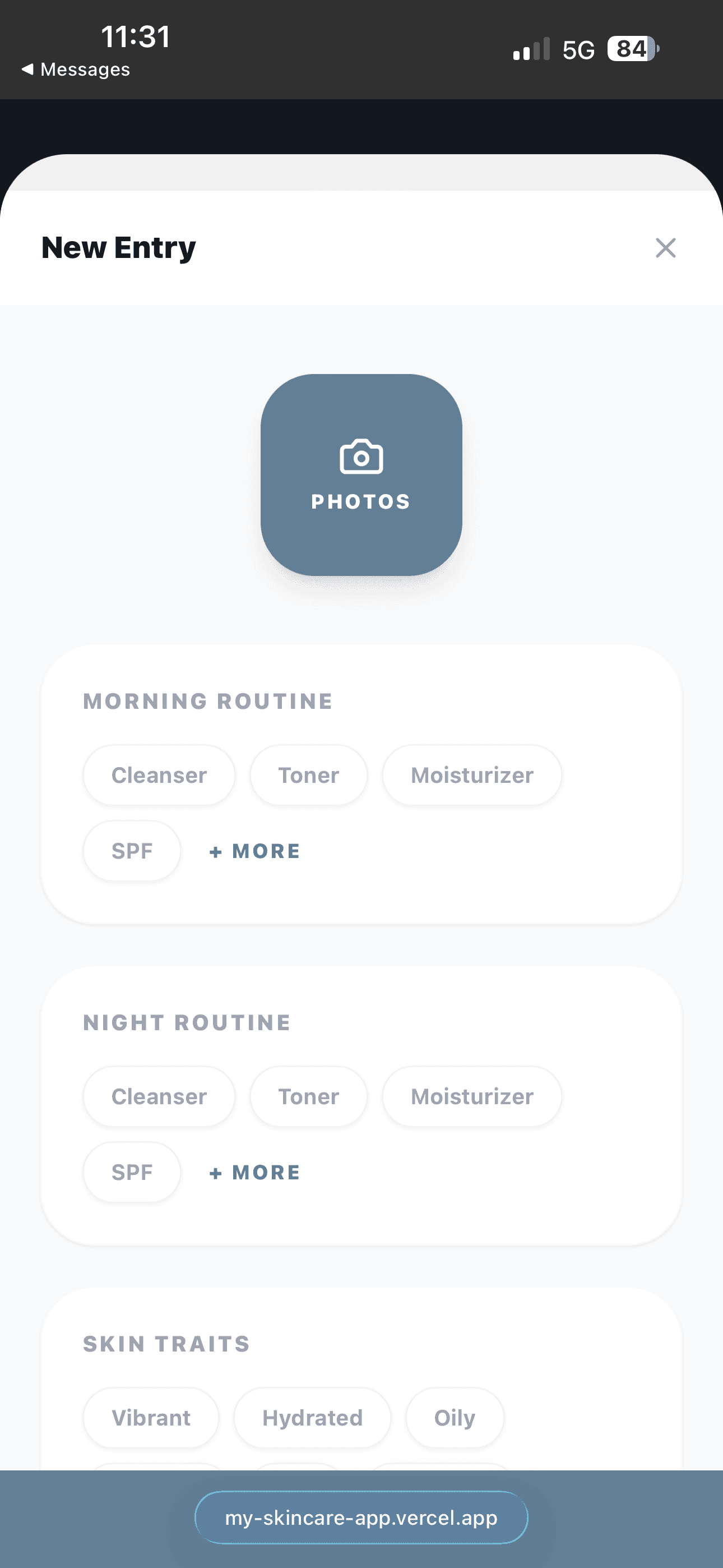
MySkin's Current Journal Entry Design

MySkin's current journal entry design was recently deployed. During internal testing, we noticed high drop off rates and even noticed ourselves lacking motivation to complete daily entries.

Despite it's clean and minimal interface, the initial design lacked 3 things:

  1. Clear hierarchy

  2. Accessibility (contrast is low)

  3. Strong affordances (it's unclear what is clickable)
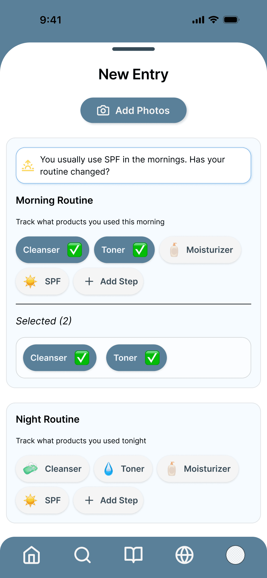
I designed two rounds of iterations for the journal entry page. I focused on specific UX gaps for these iterations.

  1. Designing clear interaction states

  2. Reducing cognitive load

  3. Increasing emotional engagement

We found the overall experience to feel transactional instead of reflective. My goal was to create an experience that encouraged the user to revisit the app consistently.

Key Design Decisions

  • Clear Selection States

    • I redesigned all selectable pills with default and selected states

    • I used high contrast colors for visual accessibility.

  • Strengthened Visual Hierarchy

    • Contrast between cards and other elements was increased

    • I improved the spacing and typography scale across the page.

    • Color was utilized to intentionally separate content on the page

    • Selected elements are highlighted and grouped for summarization within cards

  • Designed with Accessibility in Mind

    • Text and background contrast was improved

    • Tap target sizes were improved

  • Added emotional UX

    • Feedback popups were added for an engaging and conversational feel between the product and the user

  • Introduced Iconography

    • Device native icons were introduced for visual reinforcement to speed up the rate at which users recognize their inputs.

Design Highlights

Activate the tooltips with a click to view highlights from the final design

Iteration #1

Iteration #2

The Impact (Expected Outcomes)

The redesigned journal entry page will be live in spring of 2026 and these are the expected outcomes that we anticipate seeing from the user data that will be gathered following its launched:

  • Increased consistency in daily entries

  • Reduced time of completion for entries

  • Increased user satisfaction

Next Steps

  • Assess impact through testing

    • Tracking entry completion time

    • In app ratings and surveys

    • Tracking and identifying user engagement trends