Microsoft
A deep review of iterations made to Microsoft’s Fluent 2 design system
Dates
Jan 2025 - March 2025
Graduate Program Project
The Problem
In order to showcase my learnings from class, I was tasked with building an iteration of Microsoft’s Fluent 2 design system in collaboration with 4 other designers. I served as the project manager and oversaw the management and progression of this project over the course of a 10 week sprint.
The Impact
Consistency Across Products
Our design system established consistency and uniformity among the components and technical specifications that will be used across all Microsoft brands.
Improved Scalability & Adaptability
New designers can onboard quickly, developers can implement foundations and components seamlessly, and assets have the ability to adapt to numerous screen types with a reliable and well thought out design system.
Minimized Design Debt
The potential for inconsistencies within designs is significantly decreased when a detailed design system is established and utilized.
Reduced Design Overhead
With established components and documentation for their use in place, designers save time on the design process and can instead focus on solving complex user issues and diving deeper into the development of new design strategies.
Values & Principles
Following the completion of a DesignOps canvas, we fleshed out Microsoft’s operating model in order to identify key design principles that embodied Microsoft’s overall goals and future expansion plans.
It became obvious to us that Microsoft’s strength is being seen as an authority on how future professions and organizations will evolve. The organization heavily emphasizes the value of new learnings and the evolution of up-and-coming platforms and systems. Currently Microsoft is betting on AI and cloud technologies as being the next industry game changer. This key observation heavily influenced the production of the deign principles showcased below.
Universal
Microsoft’s products are guaranteed to adapt to each and every platform and user experience.
Private & Secure
Microsoft’s distinguished reputation means it has a responsibility to be a leader in privacy and security.
Community Centered
Microsoft’s mission comes across very clearly across all platforms and products which is to be inclusive and facilitate community-building.
Memorable & Distinguished
Microsoft’s image and identity is well-known and successful among users.
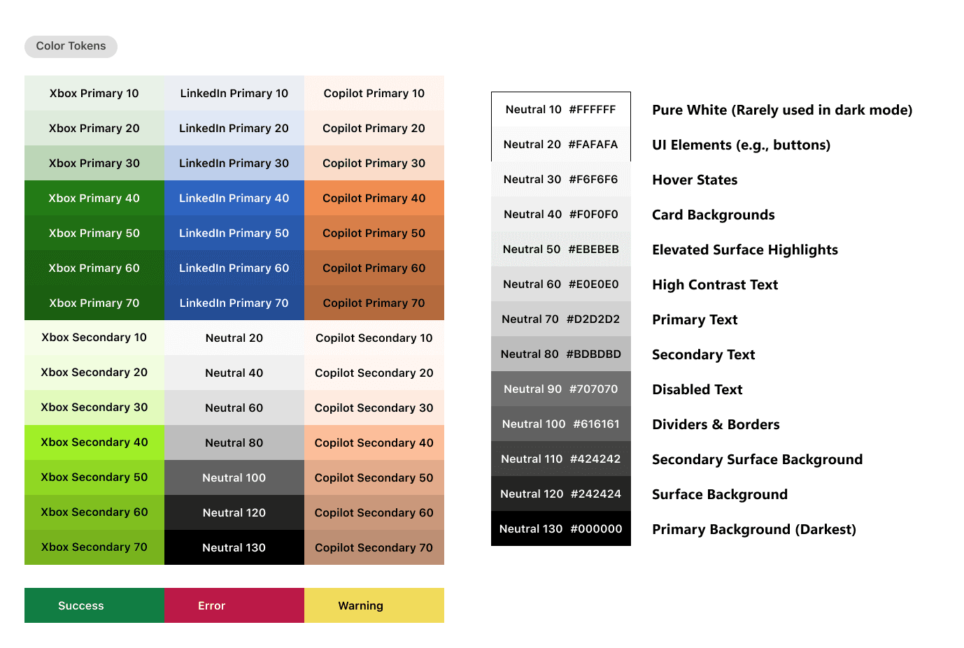
To measure the alignment of Microsoft’s current design system with the design principles identified, my team and I audited three Microsoft brands; Xbox, LinkedIn, and Copilot.
The goal was to identify inconsistencies throughout the products design foundations and components that may influence a disconnect between the relation of the products. Microsoft is an umbrella company that houses many brands.
Do these brands all live up to Microsoft’s design principles? When users interact with these brands, are they able to identify that they are apart of the Microsoft ecosystem?
We identified 4 takeaways
Xbox and LinkedIn exhibited significant inconsistencies in comparison to the overall Fluent 2 design system
LinkedIn has an overwhelming amount of asset variants
Various components failed to meet accessibility and adaptability standards
There was a lack of clarity and documentation on dark mode guidelines across the products which Xbox utilizes often
Audit Discoveries
To measure the alignment of Microsoft’s current design system with the design principles identified, my team and I audited three Microsoft brands; Xbox, LinkedIn, and Copilot.
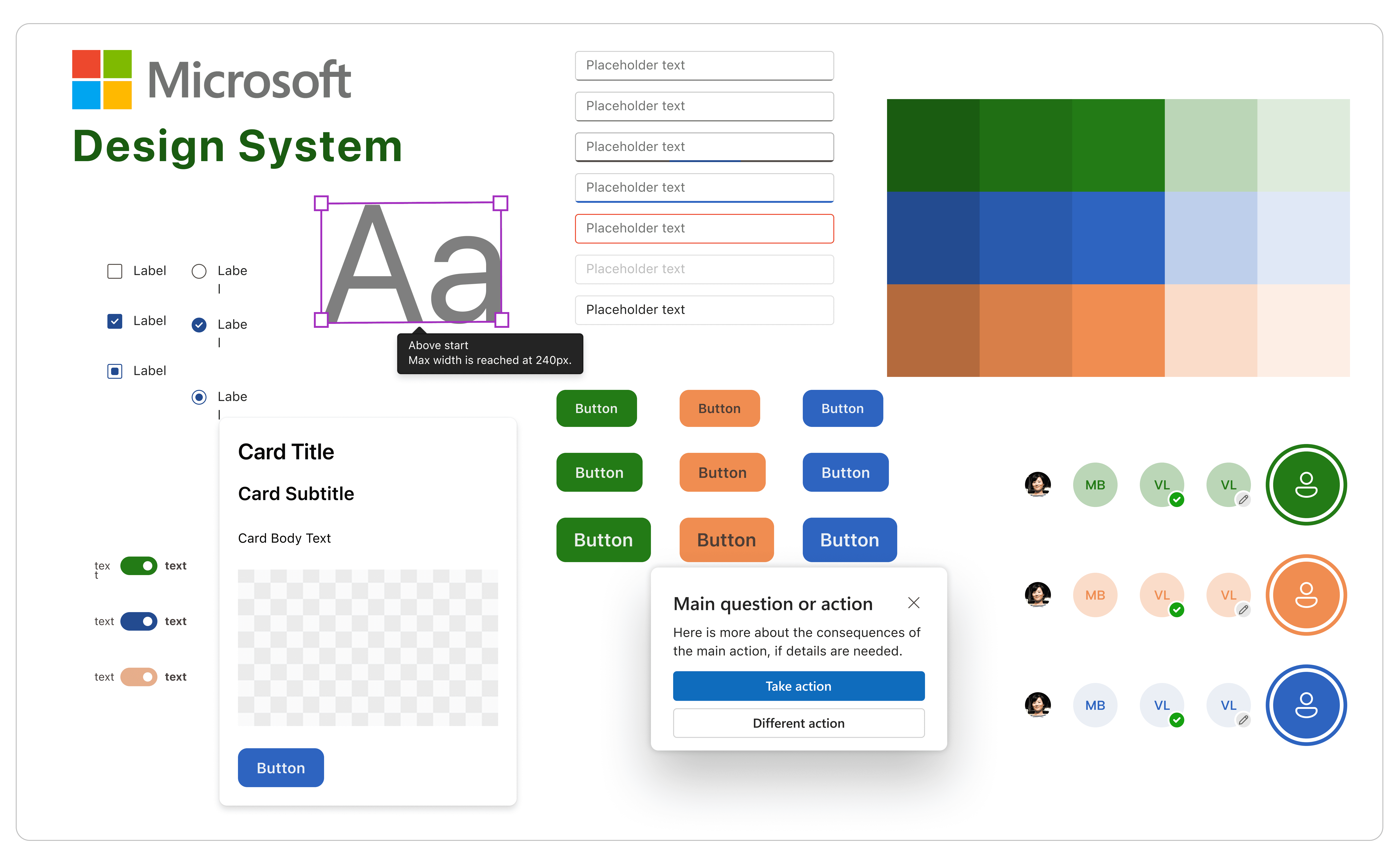
System Foundations
Buttons
We decided to design buttons that can be utilized universally across all Microsoft platforms for uniformity among all brands. This cuts down on design overhead and promotes overall brand consistency.
We focused on meeting WCAG 2.1 accessibility guidelines for the button variants. The final buttons utilize color pairs that meet contrast guidelines.
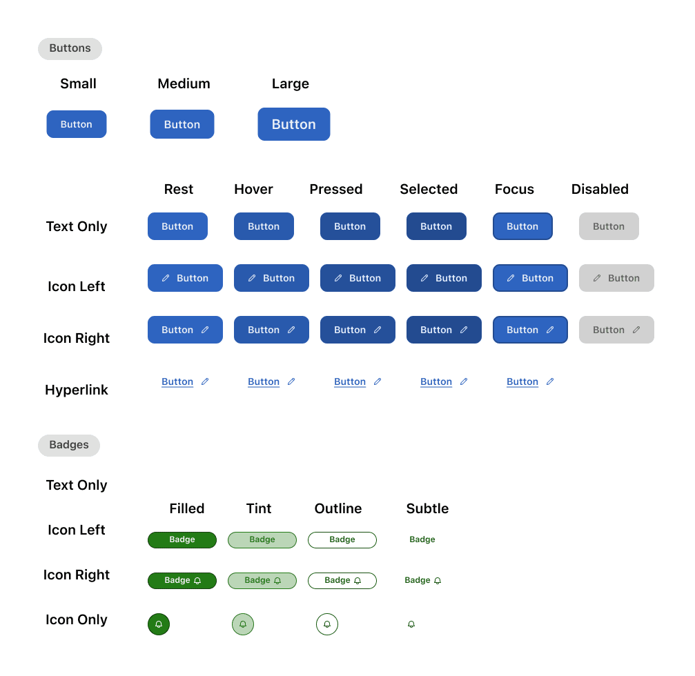
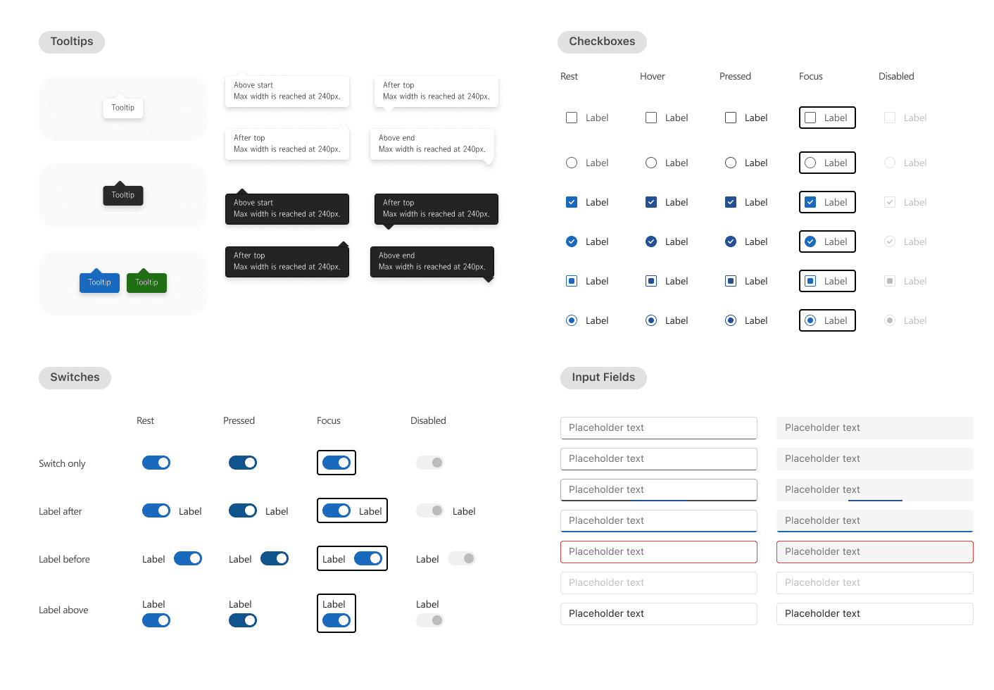
To enhance its checkbox design system, we prioritized clear selection and maintained a simple aesthetic while addressing key areas for improvement. We increased spacing between checkbox options to improve visual clarity. Additionally we increased the contrast of accompanying icons to account for visual accessibility.
Our goal was to simplify the tooltip component while expanding its versatility to accommodate Xbox and Copilot Dark Mode.
To enhance flexibility, we introduced varied tooltip arrow directions and an option to display a tooltip without an arrow, ensuring better adaptability across different UI contexts.
We focused on establishing a consistent set of input fields across Microsoft’s platforms, ensuring a seamless and familiar user experience across products. To accomplish this we standardized elements such as the border radius, font sizes, and button sizes. We also optimized placeholder texts within these fields for clarity and legibility.
This comprehensive approach to input field design promotes a more intuitive and unified user interface across Microsoft's ecosystem.
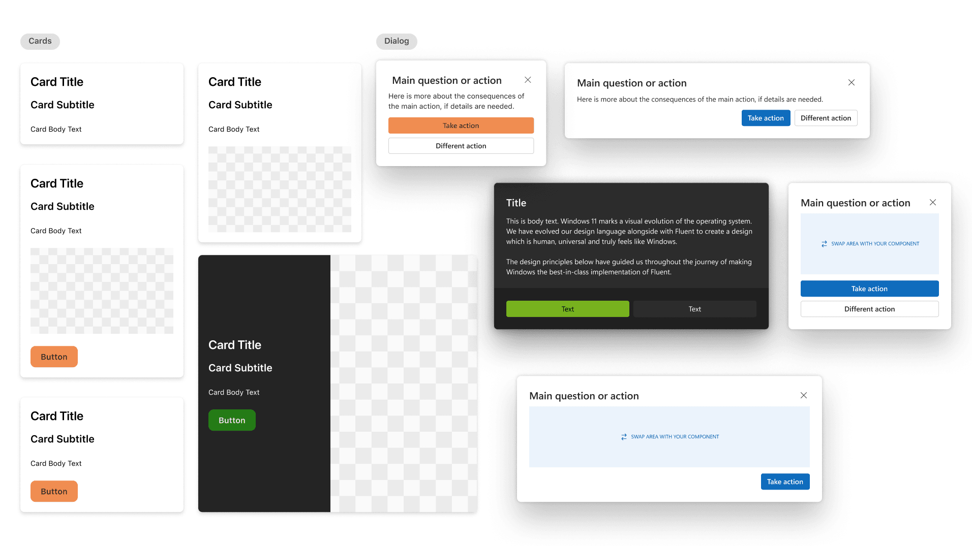
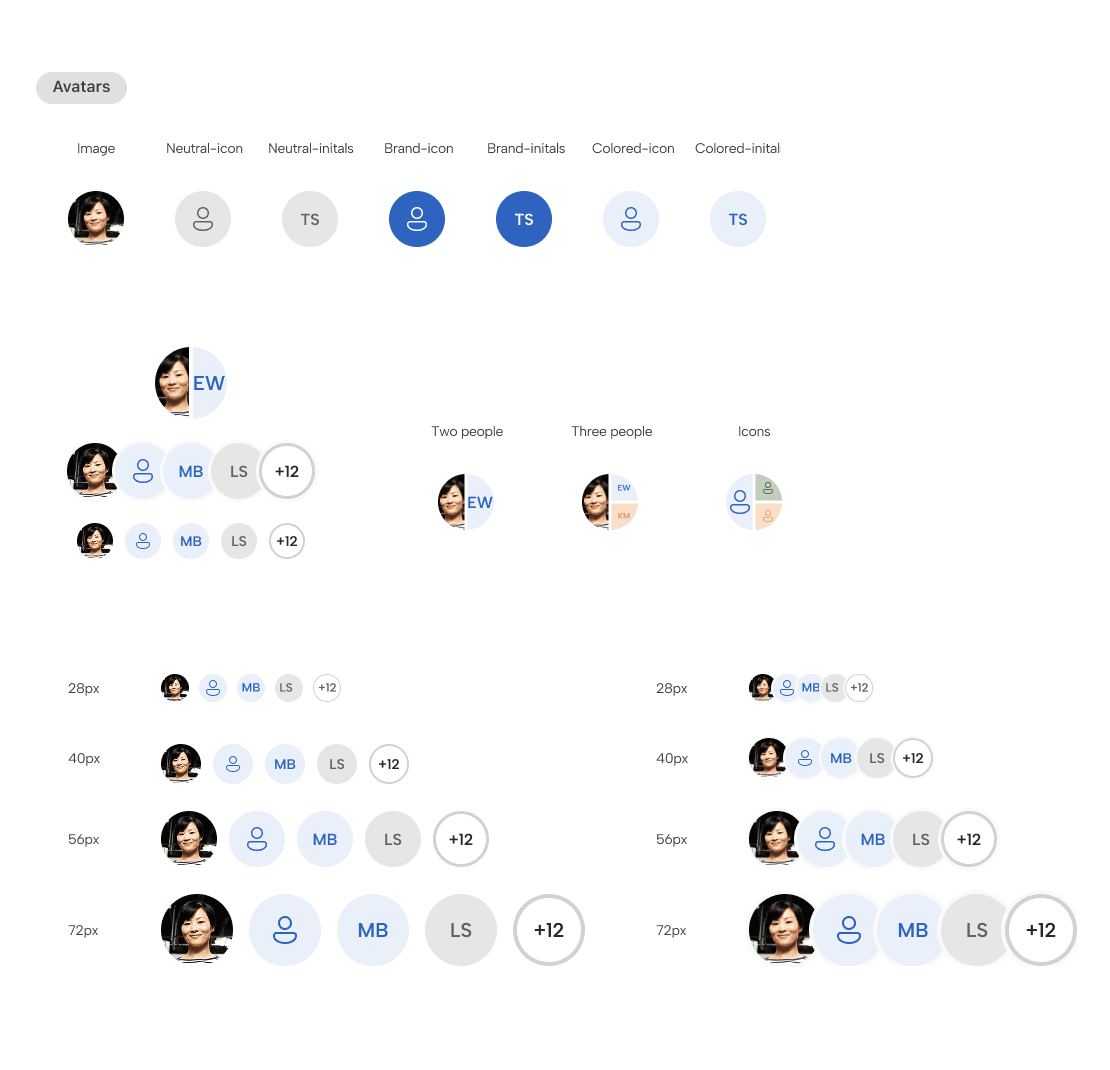
Cards & Avatars
Microsoft utilizes cards to create structure and patterns within their designs. Our goal with designing these cards was to maintain this ideal while downsizing the amount of card types available as it may become inconsistent and disrupt patterns throughout all Microsoft platforms.
Microsoft's avatar implementation is uneven across its platforms, creating a disjointed user experience. To address this, we propose developing standardized avatar components, ensuring consistent usage and a more predictable user journey. This standardized approach to avatars will foster a more intuitive and unified user experience across all platforms.
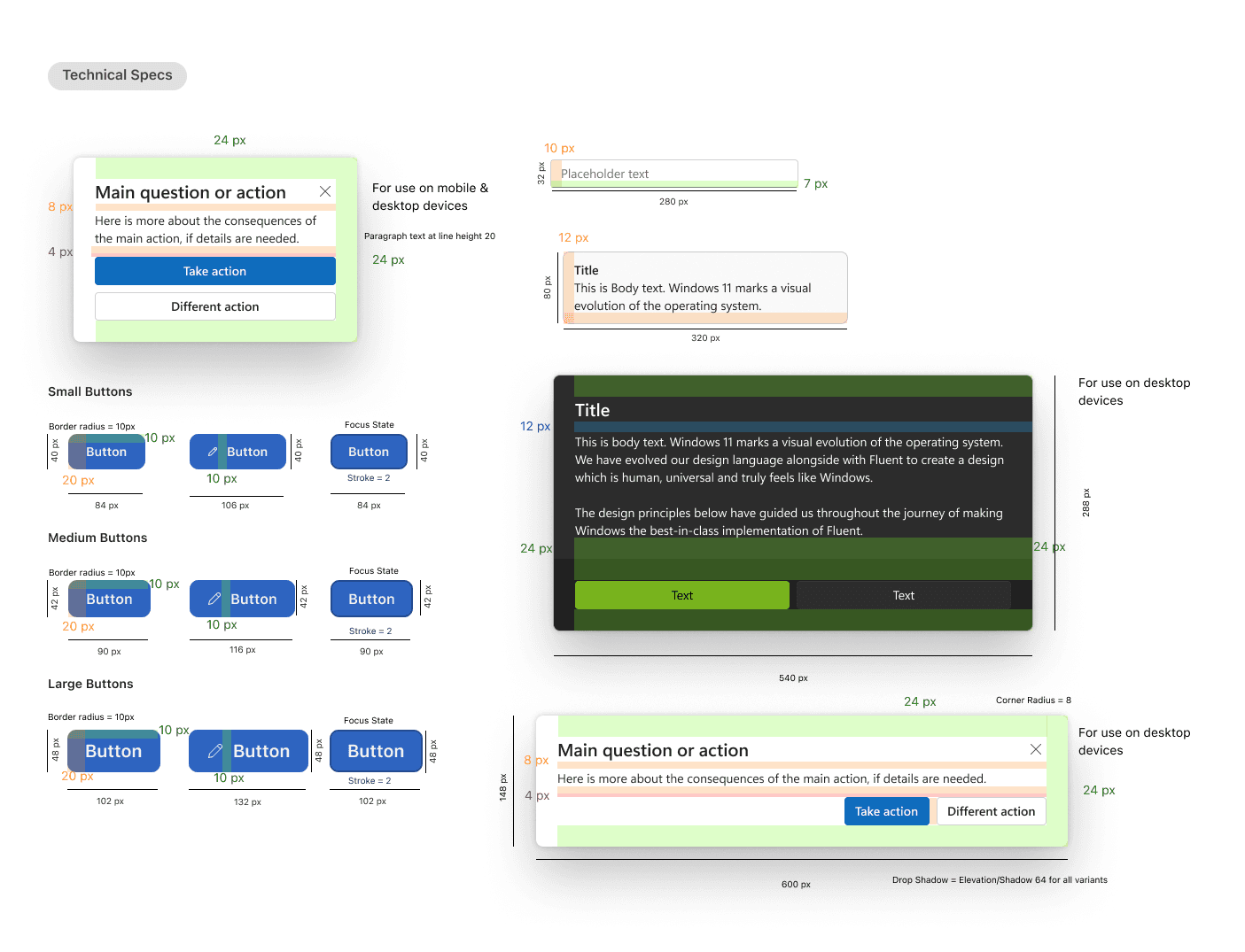
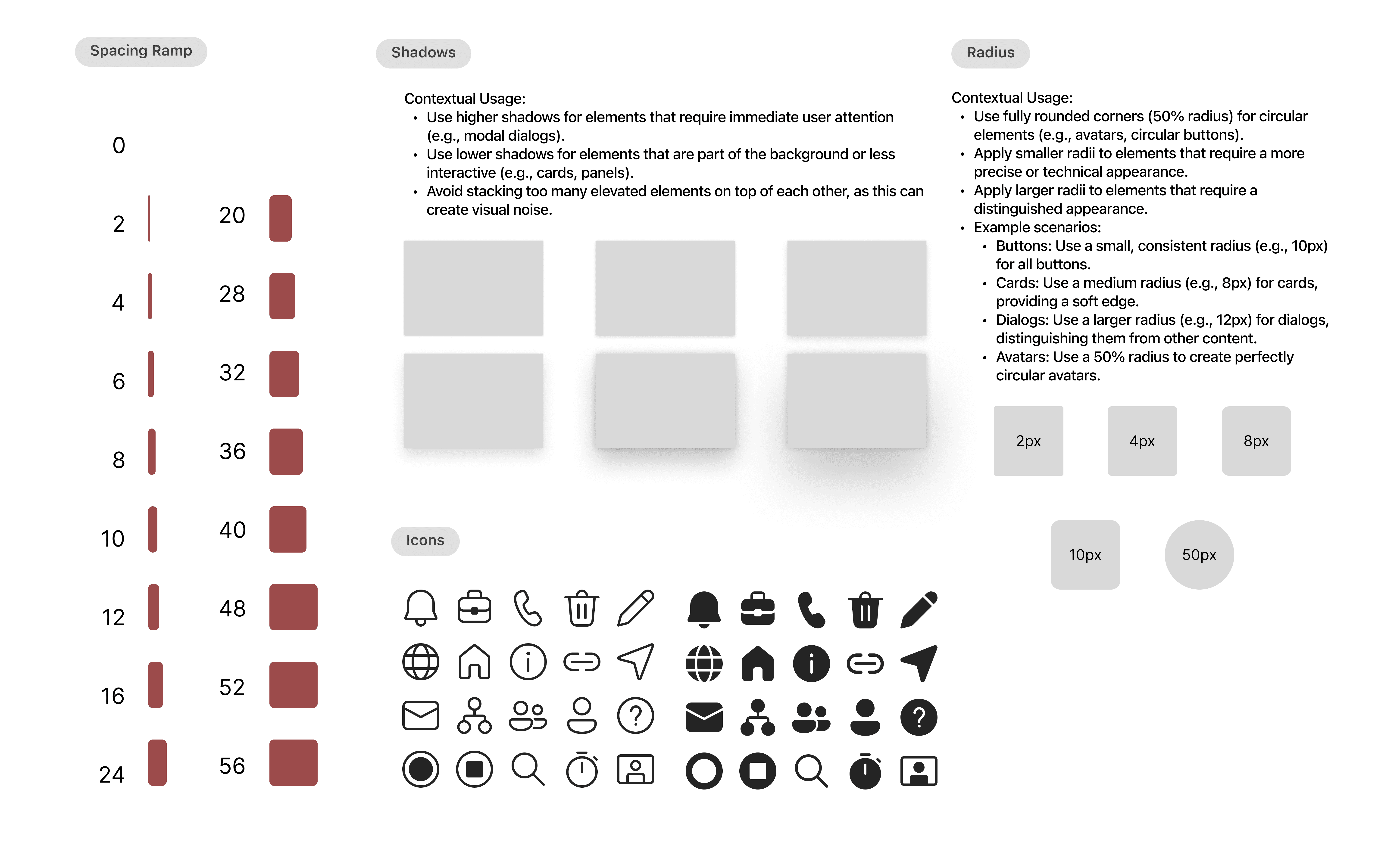
Technical Specs
Technical specifications were outlined within our design system to ensure a smooth transfer to developers. Although Figma offers an option for this currently, our goal was to guarantee that all members of a design and development team would have access to technical specs as dev mode is currently a paid feature in Figma. Dev mode within Figma also fails to fully account for interactions between components such as various states of buttons (hover, pressed, focused, etc). Developers would have to search for these specific interactions within the document. Specifying this separately saves time for developers in the long run during production.